New Fluent UI to change our entire perception of interface?

Officially unveiled as Microsoft Fluent Design System this system is to be a revamp of the company’s last testament the Modern UI but you should read on for it gets even better. Fluent Design claims to include guidelines for the designs and interactions used within software designed for all Windows 10 devices and platforms. More Insight are out
The system is based on five key components: light, depth, motion, material, and ScaleAs of yet the website has release insights on light, depth, motion and material and we are expecting to hear more about scaling soon. We have already seen some of the concepts in action in Microsoft insider and their third party apps .The design follows the basic concepts of material design with a few more of its own.
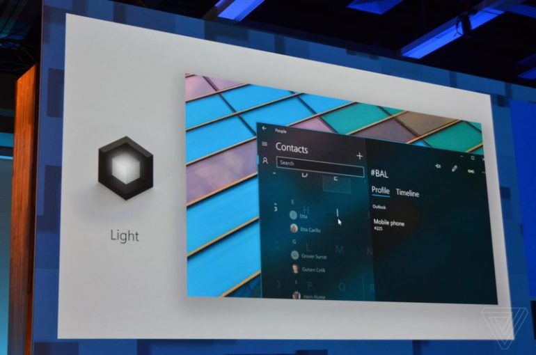
Light
Light has a way of drawing our attention. It’s warm and inviting; it’s fluid and purposeful. Light creates atmosphere and a sense of place, and it’s a practical tool to illuminate information The new UI presents us with the concept of light in navigation using this mentality. Called ‘Reveal’ they are using light to bring focus to interactive elements which light up when you scroll over.
Depth
Think about the frame that contains your information. Now break it apart, and reinvent how things relate to each other within a more layered, physical environment. This is how we’ll keep people in their flow – by giving them more space.
The use of parallax to show depth along with material usage very much similar to Google’s material design.
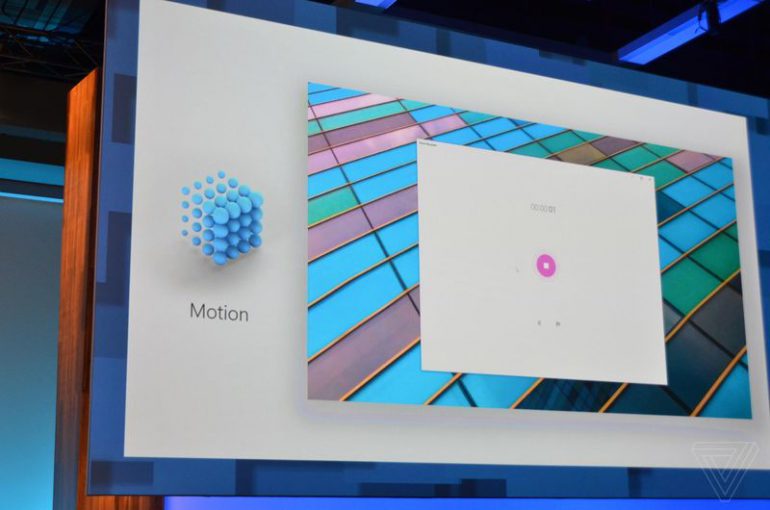
Motion
Think of motion design like a movie. Seamless transitions keep you focused on the story, and bring experiences to life. We can invite that feeling into our designs, leading people from one task to the next with cinematic ease.
Brings to us connected animation; which promises graceful and fluent transient animations. We can see an example in the beta version for Xbox as well. This is to maintain continuity and keep our attention intact.
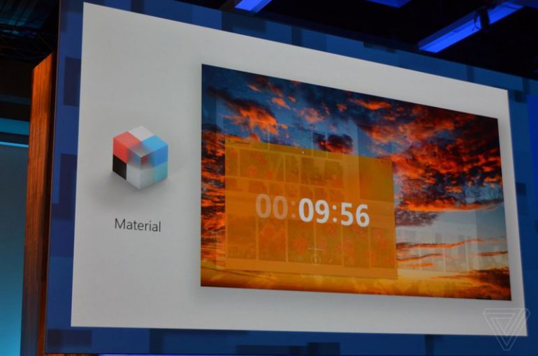
Material
The things that surround us in the real world are sensory and invigorating. They bend, stretch, bounce, shatter, and glide. Those material qualities translate to digital environments, making people want to reach out and touch our designs.
Acrylic is multi-layer sheets which instead of being opaque like the smart material used in Google’s material design is available in various transparencies depending upon hide and reveal setting.
Scale
The industry lives and breathes 2D design. Now’s the time to expand our toolkit for more dimensions. We’re scaling our design system from 0D to 3D, inviting innovation across new forms. And we’re looking to you to help us imagine this new world.
More canvas area will be available due to the ‘Conscious controls’ where in the scroll only appears when we intend to use it; on using a pen on the surface the type area automatically converts as well.
| METRO UI | MATERIAL UI | FLUENT UI | |
| MULTI-INPUT EASE | Touch sensitive | Multi Touch sensitive | Variable input recognition |
| DYNAMIC | Yes | Yes | Ease of platform shift |
| NAVIGATION | Through colour | Through colour | Through Light |
| CHANGE IN STATE | Minimum animation | Movement | Connected animation and size change |
| SEGREGATION | Blocks of colours | Spacing and usage of smart material | Parallax and introduction of acrylic |
| SEGREGATION | Blocks of colours | Spacing and usage of smart material | Parallax and introduction of acrylic |
| INTERFACE | 2-D | 2-D | 3-D |
| MATERIAL | None | Smart material | Smart material and Acrylic |
With all these things up it’s sleeve Fluent UI might just be the most futuristic response to the system of material design were it chooses to enhance rather than conflict or contradict it.